

Why Hotels Need Consistent Signage — Our Work for The Cosener’s House
If you’ve seen Channel 5’s The Hotel Inspector — in which ailing hotels are giving a makeover by the terrifying Alex Polizzi — you’ll notice that the signage almost always gets an overhaul. Apart from generally modernising the signs, they also ensure these are consistent throughout the premises. All the signs use the same palette of colours and fonts. Even the language may have the same ‘tone’ (hip, jokey, formal etc).
So why is consistency so important for hotel signs? There are two main reasons:
Consistent Signage Pleases the Eye
Signs are designed to draw your attention. Presumably, that’s why we notice when they don’t match. When a hotel has ten different signs in ten different styles, they tend to leap even more into our visual foreground, and for most people, that looks messy and discordant.
Changing up those clashing styles for one consistent one just feels right; it brings about an instant ‘ahhh, that’s better!’ Of course, if you’ve gone for a really garish colour combination, it could makes things worse… but that’s another story.
Consistent Signage Reinforces Your Brand
The second great reason for keeping things consistent is the need to reinforce your brand.
Visual branding — the colours, fonts, logos and so on that you choose — is a kind of shorthand for what you offer. Your branding is a visual cue that sticks in the memory. Top corporations understand just how powerful these cues are when it comes to consumer behaviour. That’s why they’re happy to spend eye-watering sums on the minutiae of their brands, knowing how much it benefits their bottom line.
Seen like this, signage shouldn’t just be about conveying information. Each sign you display is also an opportunity to reinforce your brand. Again, ten different signs in ten different styles won’t achieve this. If you don’t give your business a consistent identity, how do you expect them to remember it?
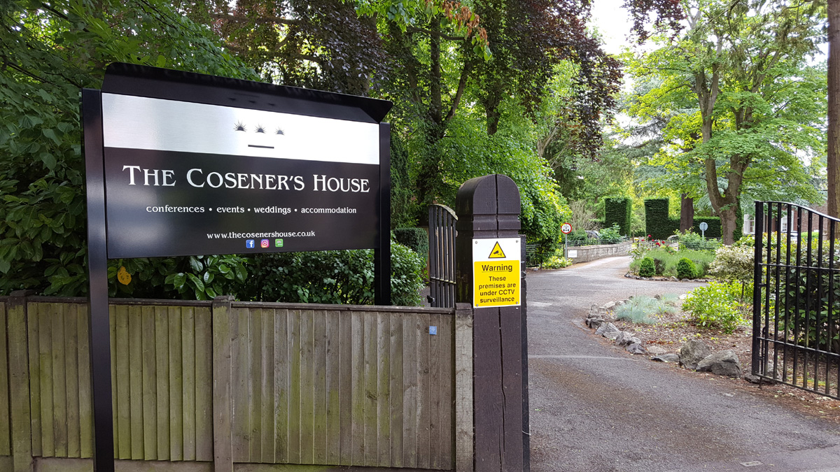
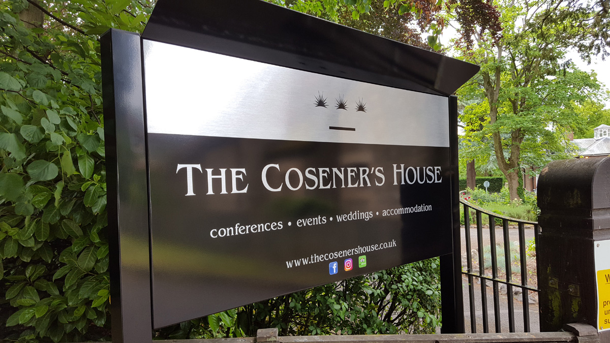
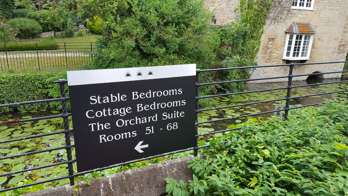
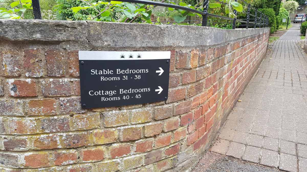
Putting it Together at The Cosener’s House
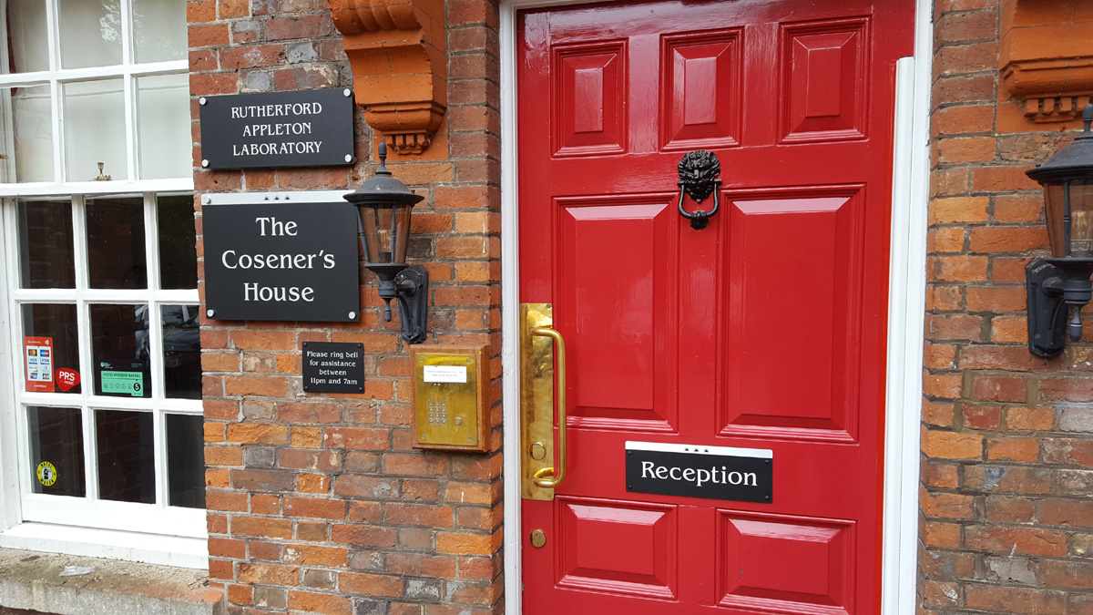
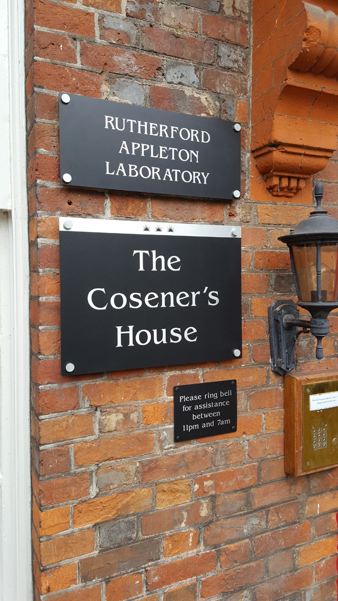
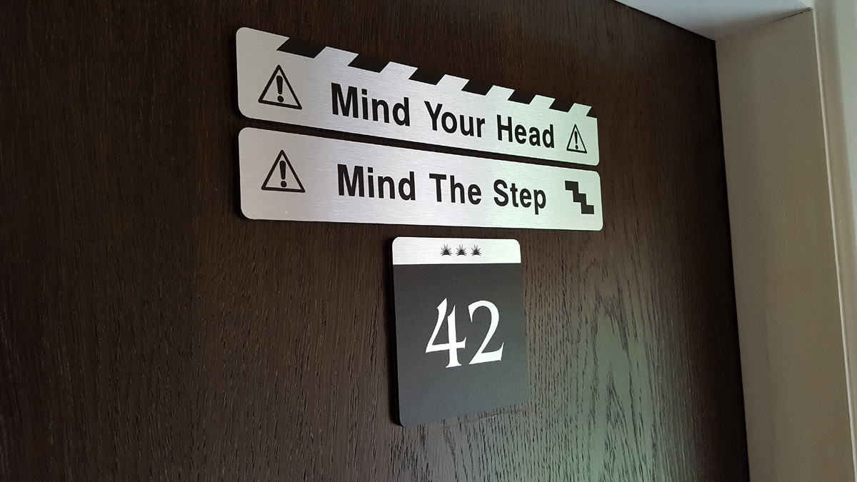
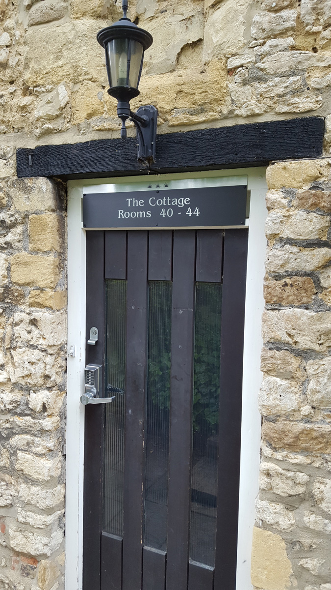
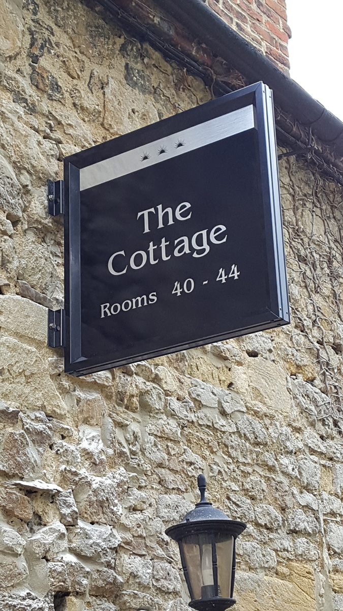
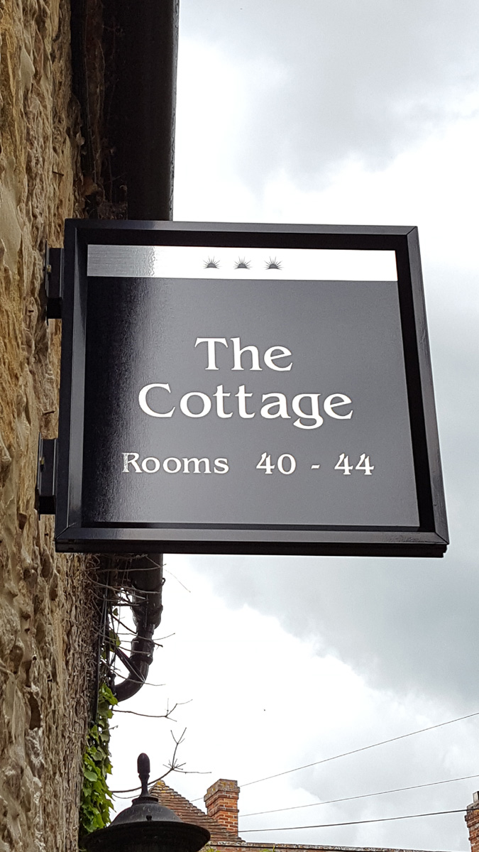
We think you can see how well all this works in the signage we installed at The Cosener’s House. This is a beautiful hotel, wedding venue and conference centre near Abingdon. The building sits right next the Thames. In fact, it’s actually on a small island and you have to cross a bridge to get to it.
We were commissioned to update all of the signage both inside and out. It involved installing a lot of signs, including the front entrance sign, building signs, internal door signs and directional signage.
Looking at the photos, you can see how well having a consistent theme works (just to be clear, we’re not taking credit for this!). We think that the signs look great: the consistent theme really helps to tie everything on the site together. And just as important, the consistency creates a clear sense of the hotel’s identity. What do you think?
Tech Specs
The wall signs were direct-printed and brushed composite. The large entrance sign has brushed silver vinyl applied to the face. At the owners’ request, we added a section to the top of the main sign, to stop tree sap and bird droppings falling on the sign face. Excellent idea!
Need to Update Your Hotel Signage?
If your hotel signs are a bit of a hotch-potch (or just becoming dated), please get in touch. As you can see from our work above, we can produce and install signs that do your establishment proud.
Comments

Archives
- June 2020 (2)
- May 2020 (1)
- April 2020 (1)
- March 2020 (1)
- February 2020 (1)
- January 2020 (1)
- December 2019 (1)
- November 2019 (1)
- October 2019 (1)
- September 2019 (1)
- August 2019 (3)
- July 2019 (1)
- June 2019 (1)
- May 2019 (1)
- April 2019 (1)
- March 2019 (1)
- February 2019 (1)
- January 2019 (1)
- December 2018 (1)
- November 2018 (1)
- October 2018 (1)
- September 2018 (1)
- August 2018 (1)
- July 2018 (1)
- June 2018 (1)
- May 2018 (1)
- April 2018 (1)
- March 2018 (1)
- February 2018 (1)
- January 2018 (1)
- December 2017 (1)
- November 2017 (1)
- October 2017 (1)
- September 2017 (1)
- August 2017 (1)
- July 2017 (1)
- June 2017 (2)
- April 2017 (1)
- March 2017 (1)
- February 2017 (1)
- January 2017 (1)
- December 2016 (1)
- November 2016 (1)
- October 2016 (1)
- September 2016 (1)
- August 2016 (1)
- September 2015 (1)
- February 2015 (1)
- December 2014 (2)
- August 2014 (3)
- July 2014 (1)
- January 2014 (1)
- December 2013 (4)

Comments are closed.