

Choosing a colour for your sign
What colour is best for your brand new sign? In this two-part post, we explore why colour can make a big difference to how your business is perceived – and whether people buy from you.
There’s a lot to consider when commissioning signs for your business. The size of the signs, satisfying planning regulations, and the number of signs are all obviously important. As we’ve argued before, it pays to get it right, with appropriate signs increasing footfall, increasing spontaneous buys and helping customers assess quality.
One decision that often gets made too quickly is the colour scheme for the signage. Often, this comes down to the owner’s personal colour preferences, or the decision is left to designer. Yet given the influence that colours have over consumer behaviour, we think it’s worth spending a little time thinking about what colour scheme best represents your brand and your business.
Just how powerful are colours in influencing consumers?
Marketing psychologists agree that colours can have a major effect on consumer behaviour. People make rapid decisions about whether they like a certain product, typically within 90 seconds. Whether they realise it or not, colour helps to guide that judgement. According to one research paper:
About 62‐90 percent of the assessment is based on colors alone. So, prudent use of colors can contribute not only to differentiating products from competitors, but also to influencing moods and feelings – positively or negatively – and therefore, to attitude towards certain products.
This is a fascinating finding. If true, it means that while you may be fussing over which of your USPs to include on your sign, your prospective customers may be making decisions based simply on what colour it is.
Where do our colour preferences come from?
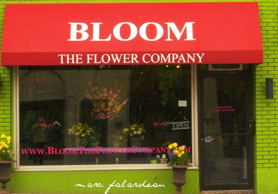
Do the colours in this awning appeal more to women? Photo courtesy Marc Falardeau
The origin of our colour preferences isn’t clear. It’s probably a mixture of evolutionary factors, gender (e.g. men tend to prefer ‘cooler’ colours), current environmental conditions (e.g. ‘warm’ colours are preferred on cold days) and our personal experiences. The key factor is probably culture, with each culture associating colours with certain emotions, values and other attributes (see part two for important cross-cultural differences).
This cocktail of variables means you’ll never pick the perfect sign colours for every prospective customer. However, there are still general trends in colour responses – and these can make a big difference to your business.
Picking the right colours for the job
Overall, the research shows that businesses need to choose colours that are appropriate for brand, product sector and situation.
Let’s take the example of signage and colour schemes for shops. In general, research shows that blue colour schemes are more conducive to purchasing. For example, a 1992 laboratory study showed that when compared to warmer colours, blue retail environments resulted in “more simulated purchases, fewer purchase postponements, and a stronger inclination to shop and browse.” Having said that, a 2003 study demonstrated that lighting makes a big difference: the researchers showed that buying increased in an orange store environment when softer lighting was introduced. Also, warmer colours can be more arresting and attract consumer attention, suggesting that they can be particularly appropriate for attracting spontaneous purchases (perhaps for special offers?).
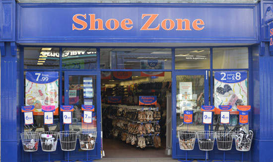
How does the shop and sign colour affect consumer behaviour? Photo courtesy speedpropertybuyers.co.uk
In choosing colours for signs, it can also be useful to consider what the competition is doing. For example, if consumers already associate a colour with a particular type of product, businesses are faced with a choice: go with the flow or be different. Both can work – it just depends on how brave you want to be. Businesses will often ride on the coat tails of a brand leader by choosing similar colours. For example, Cadbury’s tried fiercely (and unsuccessfully) to protect its distinctive purple wrapper, to prevent competitors cashing in on their success. On the other hand, when Starbucks was trying to carve out a new identity, the marketing team bucked the trend for brown coffee-shop signs with a new and distinctive green. Overall, we think local businesses are well-advised to pay attention to their competitor’s signs, particularly if these are large, well-known franchises.
In Part Two, we will look at how to use colours to reflect the personality of your brand or product, and some all-important cultural differences.
In the meantime, for further advice on all aspects of signage (including colour choices), talk to the experts at one of Wiltshire’s leading signmaking companies.
Comments

Archives
- June 2020 (2)
- May 2020 (1)
- April 2020 (1)
- March 2020 (1)
- February 2020 (1)
- January 2020 (1)
- December 2019 (1)
- November 2019 (1)
- October 2019 (1)
- September 2019 (1)
- August 2019 (3)
- July 2019 (1)
- June 2019 (1)
- May 2019 (1)
- April 2019 (1)
- March 2019 (1)
- February 2019 (1)
- January 2019 (1)
- December 2018 (1)
- November 2018 (1)
- October 2018 (1)
- September 2018 (1)
- August 2018 (1)
- July 2018 (1)
- June 2018 (1)
- May 2018 (1)
- April 2018 (1)
- March 2018 (1)
- February 2018 (1)
- January 2018 (1)
- December 2017 (1)
- November 2017 (1)
- October 2017 (1)
- September 2017 (1)
- August 2017 (1)
- July 2017 (1)
- June 2017 (2)
- April 2017 (1)
- March 2017 (1)
- February 2017 (1)
- January 2017 (1)
- December 2016 (1)
- November 2016 (1)
- October 2016 (1)
- September 2016 (1)
- August 2016 (1)
- September 2015 (1)
- February 2015 (1)
- December 2014 (2)
- August 2014 (3)
- July 2014 (1)
- January 2014 (1)
- December 2013 (4)
Comments are closed.