

Choosing a colour for your sign – Part Two
The colours you choose for your signage make a difference. In Part One of this post, we looked at how colour has a powerful effect on consumers, and considered some of your colour options. In this part, we’ll look at how colours affect how your brand or product is perceived, and some important cultural differences.
Colour and brand perception

Does this sign evoke feelings of power, energy and warmth?
Before consumers even try your service or product, before any research or comparisons are made, they will judge you on the brand colours you use – including those on your signage.
This may seem far-fetched, but it’s a finding supported by some solid research. From a very young age, we’re bombarded by branding, and it seems likely that we gradually build up associations between colours and certain sorts of product. While we’re doing that, we’re also gradually soaking up associations between colours and more abstract values, such as anger, trust, and reliability.
The result of all this unconscious learning is that when we arrive at adulthood, colours tend to trigger certain moods or ideas.
According to California State University (CSU), the psychological responses evoked by different colours are as follows:
- White: purity, cleanliness, precision, innocence, sterility, death
- Black: power, sexuality, sophistication, death, mystery, fear, unhappiness, elegance
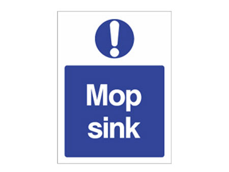
- Blue: trust, conservative, security, technology, cleanliness, order
- Green: nature, health, good luck, jealousy, renewal
- Yellow: optimism, hope, philosophy, dishonesty, cowardice, betrayal
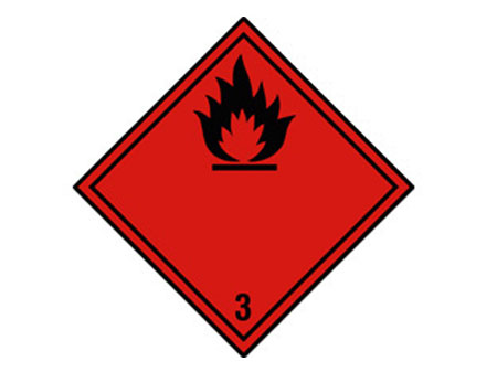
- Red: power, energy, warmth, passions, love, aggression, danger
- Purple: spirituality, mystery, royalty, transformation, cruelty, arrogance
- Brown: earth, reliability, comfort, endurance
- Grey: intellect, futurism, modesty, sadness, decay
Does this mean that you shouldn’t choose grey signs for your new bistro because it may evoke feelings of decay? Not at all. Our advice is to think instead about the positive values you want to project and go from there.
![]() As an example, you might remember when Egg Banking was launched. A branch of The Prudential, Egg were one of the very first UK Internet banks. The groundbreaking concept of online banking needed branding to match. As a name ‘Egg’ suggests the birth of something new. You could also say that the simplicity of using internet banking (compared to traditional banking) is reflected in a single short, easy word. When it came to colour choice, the fledgling company weren’t aiming to communicate conservatism. The colours had to suggest renewal and freshness too. Therefore, the colour chosen for the brand was a bright, saturated green.
As an example, you might remember when Egg Banking was launched. A branch of The Prudential, Egg were one of the very first UK Internet banks. The groundbreaking concept of online banking needed branding to match. As a name ‘Egg’ suggests the birth of something new. You could also say that the simplicity of using internet banking (compared to traditional banking) is reflected in a single short, easy word. When it came to colour choice, the fledgling company weren’t aiming to communicate conservatism. The colours had to suggest renewal and freshness too. Therefore, the colour chosen for the brand was a bright, saturated green.
Cultural differences in colour perception
The colour associations above come with a health warning: they all depend on who you’re selling to. As we noted above, we get these associations through exposure to the dominant culture around us. And so it stands to reason that consumers in different cultures might have some very different responses to colour.
For many businesses that are trading locally, this might not be a matter of great concern. However, for businesses that are selling further afield, it’s as well to have a broader cultural awareness of colours.
The good people at thoughtcom.co.uk have assembled an useful resource detailing the significance of various colours in a number of cultures. For example, if you’re planning to export western wedding dresses to Thailand, you might want to avoid branding your business with a lovely royal purple – in Thai culture, purple is associated with widows and mourning.
Here are some other notable cultural differences in colour perception, mainly drawn from CSU:
- In India and other parts of Asia, white may be associated with death
- In China and France, green packaging isn’t well received, though it’s been ‘successful in attracting investors in the Middle East’
- For Hindus, yellow is a sacred colour
- Yellow in particular has many different cultural associations. e.g. royalty and nourishment in China, mourning in Egypt, courage in Japan
- In Korea, pink symbolises trust.
Final thoughts…
There’s a danger that reading these two blog posts only leaves you paranoid about choosing the wrong colour for your signage. We’d hate that to happen. If you’re really not certain what direction to go in, you can always spend a while googling the top brands in your sector. If you start to see common colour themes, there’s nothing wrong with you adopting the same approach. The other thing you can do is ask an experienced signmaker like Mirage Signs. With years of experience in many different sectors, we’re sure we can offer some suggestions.
Comments

Archives
- June 2020 (2)
- May 2020 (1)
- April 2020 (1)
- March 2020 (1)
- February 2020 (1)
- January 2020 (1)
- December 2019 (1)
- November 2019 (1)
- October 2019 (1)
- September 2019 (1)
- August 2019 (3)
- July 2019 (1)
- June 2019 (1)
- May 2019 (1)
- April 2019 (1)
- March 2019 (1)
- February 2019 (1)
- January 2019 (1)
- December 2018 (1)
- November 2018 (1)
- October 2018 (1)
- September 2018 (1)
- August 2018 (1)
- July 2018 (1)
- June 2018 (1)
- May 2018 (1)
- April 2018 (1)
- March 2018 (1)
- February 2018 (1)
- January 2018 (1)
- December 2017 (1)
- November 2017 (1)
- October 2017 (1)
- September 2017 (1)
- August 2017 (1)
- July 2017 (1)
- June 2017 (2)
- April 2017 (1)
- March 2017 (1)
- February 2017 (1)
- January 2017 (1)
- December 2016 (1)
- November 2016 (1)
- October 2016 (1)
- September 2016 (1)
- August 2016 (1)
- September 2015 (1)
- February 2015 (1)
- December 2014 (2)
- August 2014 (3)
- July 2014 (1)
- January 2014 (1)
- December 2013 (4)

Comments are closed.